

💭Imagine you are two years old…
You walk into your early years setting and everywhere around you are labels, banners, instructions and invitations to play.
But you cannot yet read any of them. 🤔
Some include photographs. 🖼️
Some use symbols. 🔣
But many are simply words. 📜
How much of the environment could you genuinely understand independently?
And how much would simply fade into the background?
Recently, I’ve found myself reflecting much more carefully on the amount of print surrounding children within early years environments.
Not because print is wrong, and not because signage has no value, but because I increasingly found myself questioning the purpose behind some of it.
Interestingly, this reflection became even stronger while scrolling social media and looking at invitations to play, downloadable banners and display ideas online. Increasingly, I found myself wondering how much early years print is genuinely designed for children… and how much is actually designed for the adults viewing the environment.
When you really stop and look closely, a huge proportion of early years signage is predominantly adult words.
Beautifully designed.
Carefully worded.
Often visually appealing.
💭But if you are two years old and cannot yet independently read the text surrounding the activity, what part of the invitation are you actually accessing?
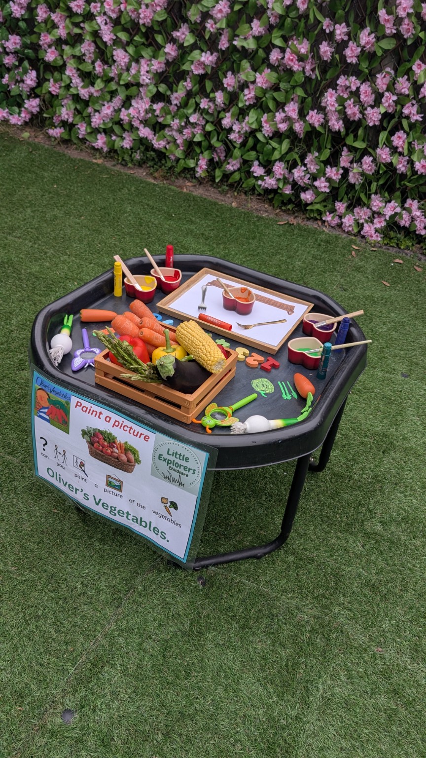
Oliver’s Vegetables 🥕🥔🫛
This led me to start thinking much more carefully about keeping our own signage highly visual and genuinely accessible to children.
A good example of this came through our recent Oliver’s Vegetables explorations.
The invitation to play itself was intentionally very visual. Real vegetables, photographs, paintbrush symbols and simple visual prompts were helping to communicate the experience long before children needed to access any written wording.
Alongside this, I also started creating much more visual “can you…” style prompts linked directly to real experiences within the provision:
Can you paint the vegetables? 🎨
Can you shell the peas? 🫛
Can you wash the potatoes? 🥔
Can you peel the carrots? 🥕
Can you make beetroot salad?
This is where the reflection deepened for me…
What interested me was not simply the wording itself, but whether the print genuinely served a purpose.
Did it help children understand what was available to them?
Did it support independence?
Did it encourage interaction?
Or was it simply more text added into an already visually busy environment?
This certainly is not an argument against print altogether. Some signage absolutely does support children’s independence, particularly when paired carefully with photographs, symbols and consistent use.
But I do think it is worth physically walking around our own environments through the eyes of a two-year-old.
What can they genuinely understand without adult explanation?
What is actually helping them?
Which parts of the environment are truly accessible to them?
And at what point does meaningful print quietly become visual wallpaper?
Reflections for Practitioners 💭
Perhaps it is worth slowly walking around your own setting this week through the eyes of your youngest children.
Which parts of the environment are genuinely communicating meaning to them?
Which signs support independence?
Which invitations to play are truly accessible before adult explanation is needed?
If all the words disappeared tomorrow, how much of the environment would children still understand independently through the visuals, objects and experiences themselves?